BUMPIN'25
A conceptual music festival celebrating 2010s nostalgia, when music became an escape from economic hardship. Musically exciting but visually grounded.
A conceptual music festival celebrating 2010s nostalgia, when music became an escape from economic hardship. Musically exciting but visually grounded.
Visual Design
Branding
Project Overview
Project Overview
Team: Brian Yoo, Catherine Mercado, Aiden Moeck
Timeline: 7 weeks (2025)
Skills: Visual System, Branding
My Role: Graphic Designer
Team: Brian Yoo, Catherine Mercado, Aiden Moeck
Timeline: 7 weeks (2025)
Skills: Visual System, Branding
My Role: Graphic Designer
✦ A visual system for Bumpin'25, a festival celebrating 2010s nostalgia and the era's resilient spirit, where music became an escape from economic uncertainty and a source of collective hope. Worked alongside two other talented graphic designers.
✦ A visual system for Bumpin'25, a festival celebrating 2010s nostalgia and the era's resilient spirit, where music became an escape from economic uncertainty and a source of collective hope. Worked alongside two other talented graphic designers.
VISUALIZING RECESSION POP
VISUALIZING RECESSION POP

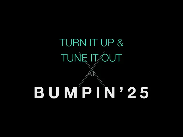
Teaser Video
Teaser Video

Using music as a means of coping with the effects of the great recession.
Using music as a means of coping with the effects of the great recession.
Initial Concepts
Initial Concepts
Draft 1
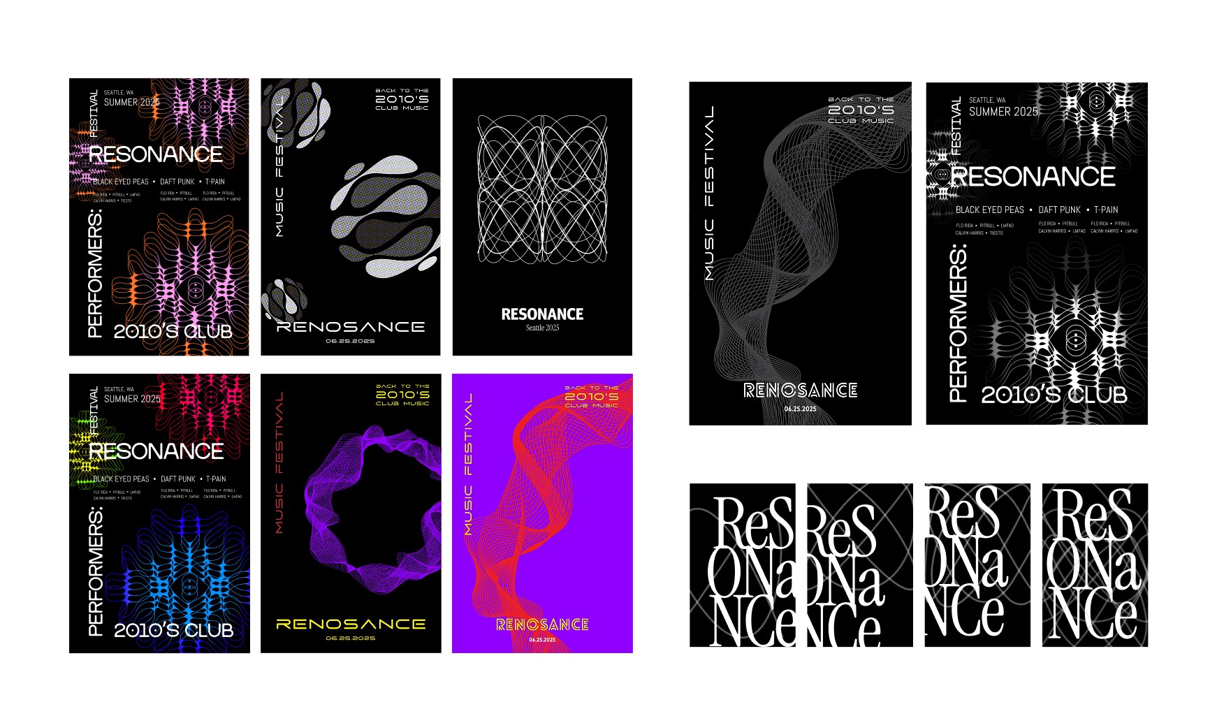
Draft 1
Draft 1
Draft 2
Draft 2

Draft 3
Draft 3
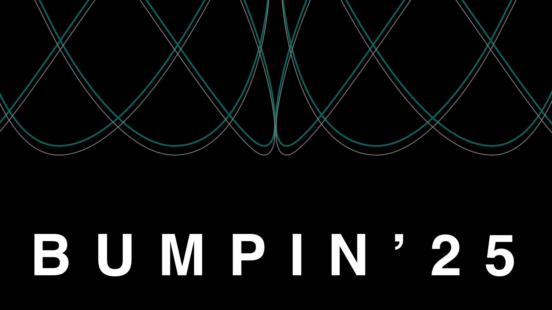
Visual System
Visual System
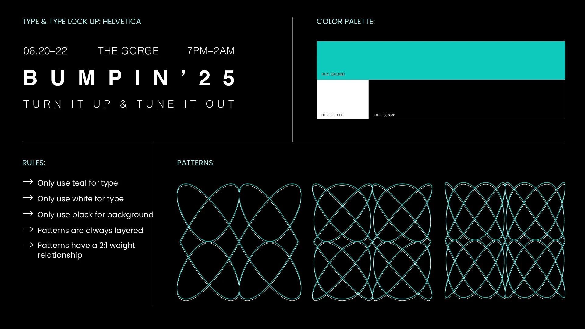
The thin-lined shapes were inspired by exploring the emotional and physical qualities of music through visualization, beautiful patterns created from the vibrations of sound waves. Our goal was to create a music festival experience that goes beyond just listening: music you can hear, see, and feel. We developed a design system with consistent patterns applied across all festival applications and poster designs, ensuring visual cohesion throughout the brand experience.
The thin-lined shapes were inspired by exploring the emotional and physical qualities of music through visualization, beautiful patterns created from the vibrations of sound waves. Our goal was to create a music festival experience that goes beyond just listening: music you can hear, see, and feel. We developed a design system with consistent patterns applied across all festival applications and poster designs, ensuring visual cohesion throughout the brand experience.
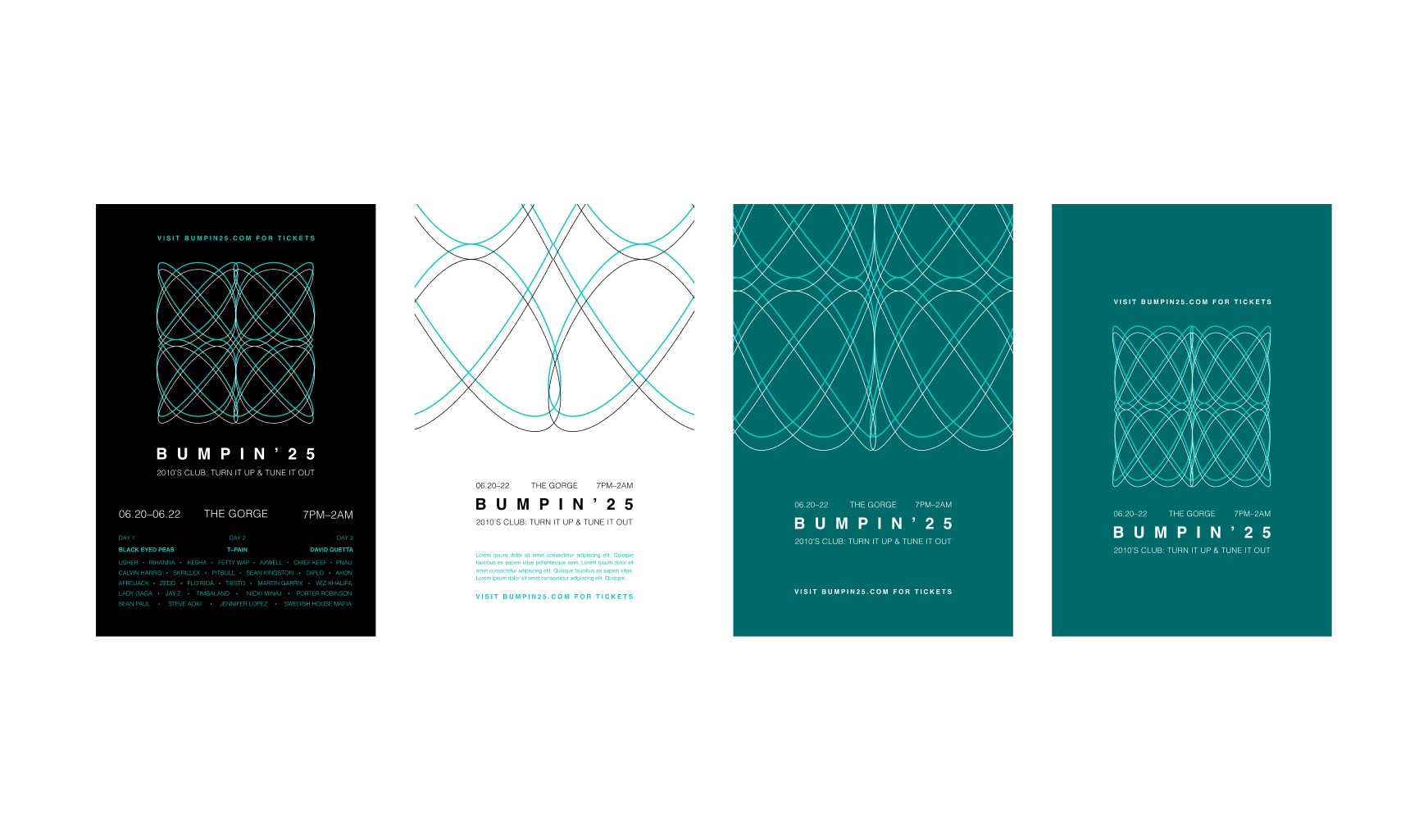
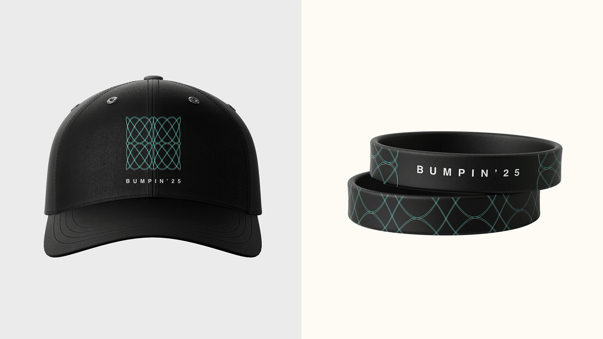
Application
Application
The initial concept for BUMPIN'25 explored tech-inspired themes with neon and bright colors reminiscent of club and party scenes. We then shifted direction by examining album cover designs from popular 2010s music, specifically EDM albums like Calvin Harris's Motion. Drawing from this inspiration, we developed a design system using the album's color palette that better aligned with our creative vision and direction.
The initial concept for BUMPIN'25 explored tech-inspired themes with neon and bright colors reminiscent of club and party scenes. We then shifted direction by examining album cover designs from popular 2010s music, specifically EDM albums like Calvin Harris's Motion. Drawing from this inspiration, we developed a design system using the album's color palette that better aligned with our creative vision and direction.

These applications demonstrate our consistent design system and cohesive visual language. Each piece maintains the same thin-lined shapes and sound wave-inspired patterns while adapting to different formats and use cases, creating a unified brand experience across all festival touchpoints.
These applications demonstrate our consistent design system and cohesive visual language. Each piece maintains the same thin-lined shapes and sound wave-inspired patterns while adapting to different formats and use cases, creating a unified brand experience across all festival touchpoints.
Reflection
This project taught me how to translate a cultural moment into a cohesive visual identity. Designing around "musically exciting but visually calm" pushed me to make deliberate, restrained choices, grounding every decision in the emotional context of the Great Recession.
Collaborating in a group of three was equally valuable. We leaned into each other's strengths early on, with me taking the lead on wayfinding and website design while staying involved in each other's work through constant feedback. That balance of ownership and collaboration, backed by strong communication and organization, kept the project unified from start to finish.